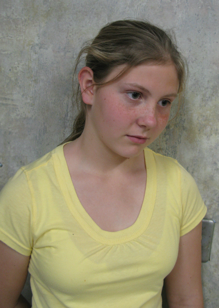
 Taylor is the daughter of a friend of mine. She needed a poster for her part in a talent show on the last day of school. Taylor’s original idea was to copy the art from the music CD. I had other ideas, and asked her if she would allow me to make new art, like it was her own CD cover. So, she stood in front of a plain background, and I asked her to try to look sad, and I got this photo at left.
Since early 2001, my photo manipulation software of choice is Adobe Photoshop. I learn something new almost every day, and there are entire areas of operation I have not even begun to learn yet. I have many years of work ahead of me.
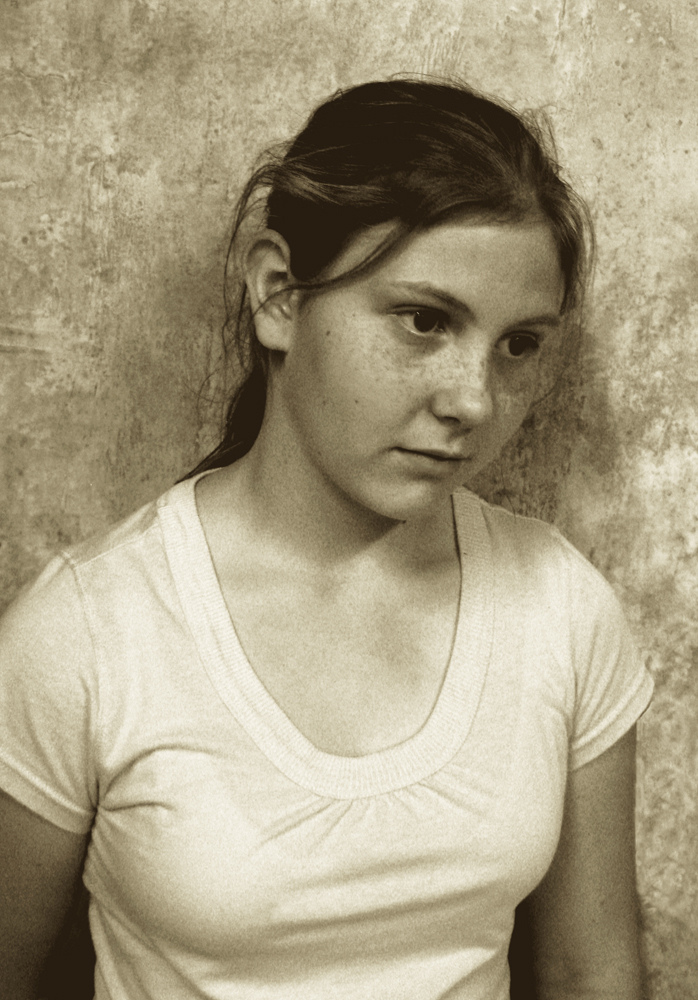 For this project, I first desaturated the image, making it look like black and white. Then I added sepia tones. Using multiple layers with different levels of richness of tone, I chose different areas of the image to show particular layers. Once I had made those choices, I grabbed a merged copy of the entire image, and that layer became the image at right.
Next, grain was added, fading with an overlay, until the texture was what I was looking for. The last step was to add the text. The only colors existing in the background image are brown, white, and some grades between. I used a toned-down orange in the title for the one additional color.
Now, here is the finished poster.

